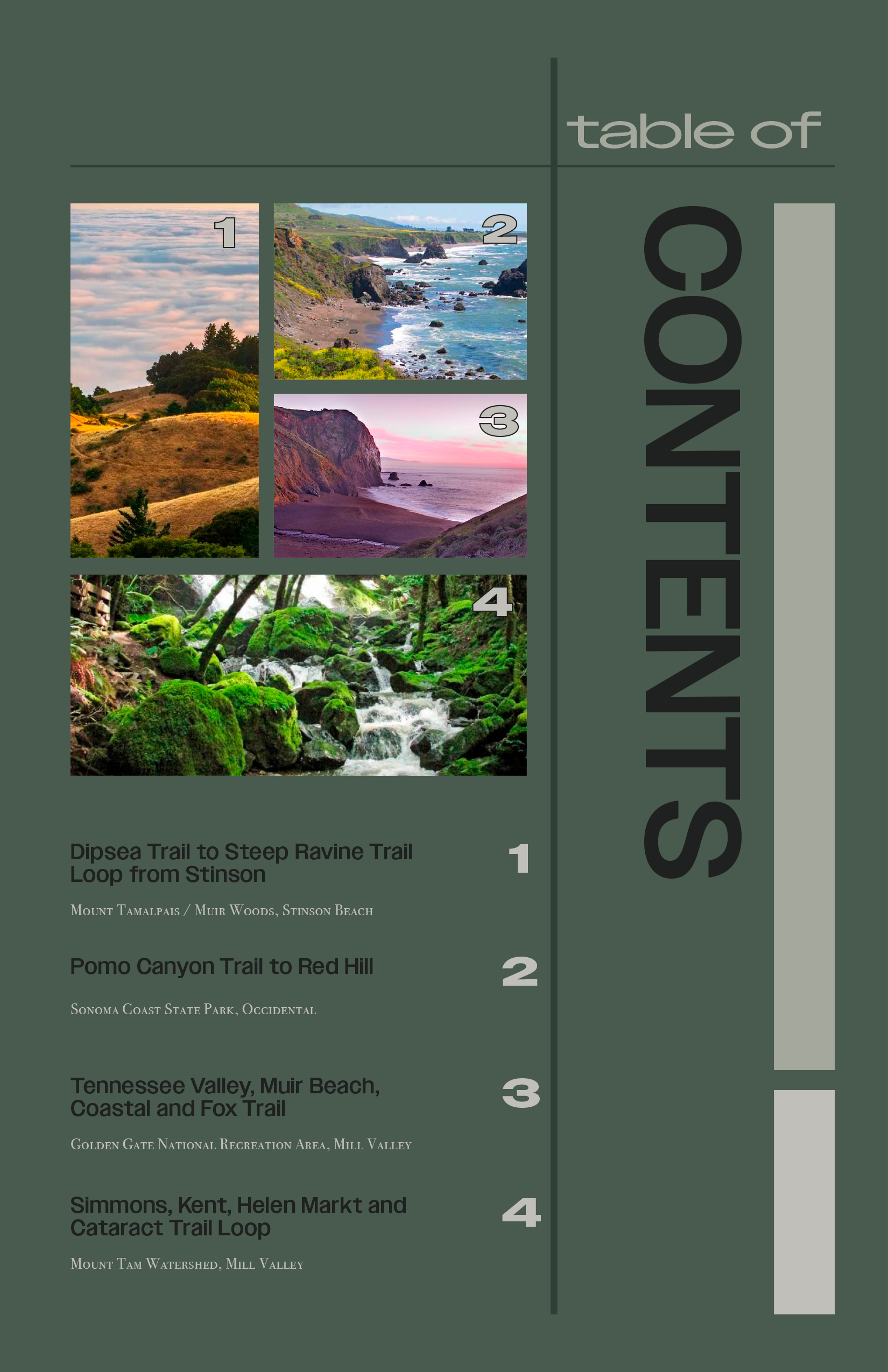
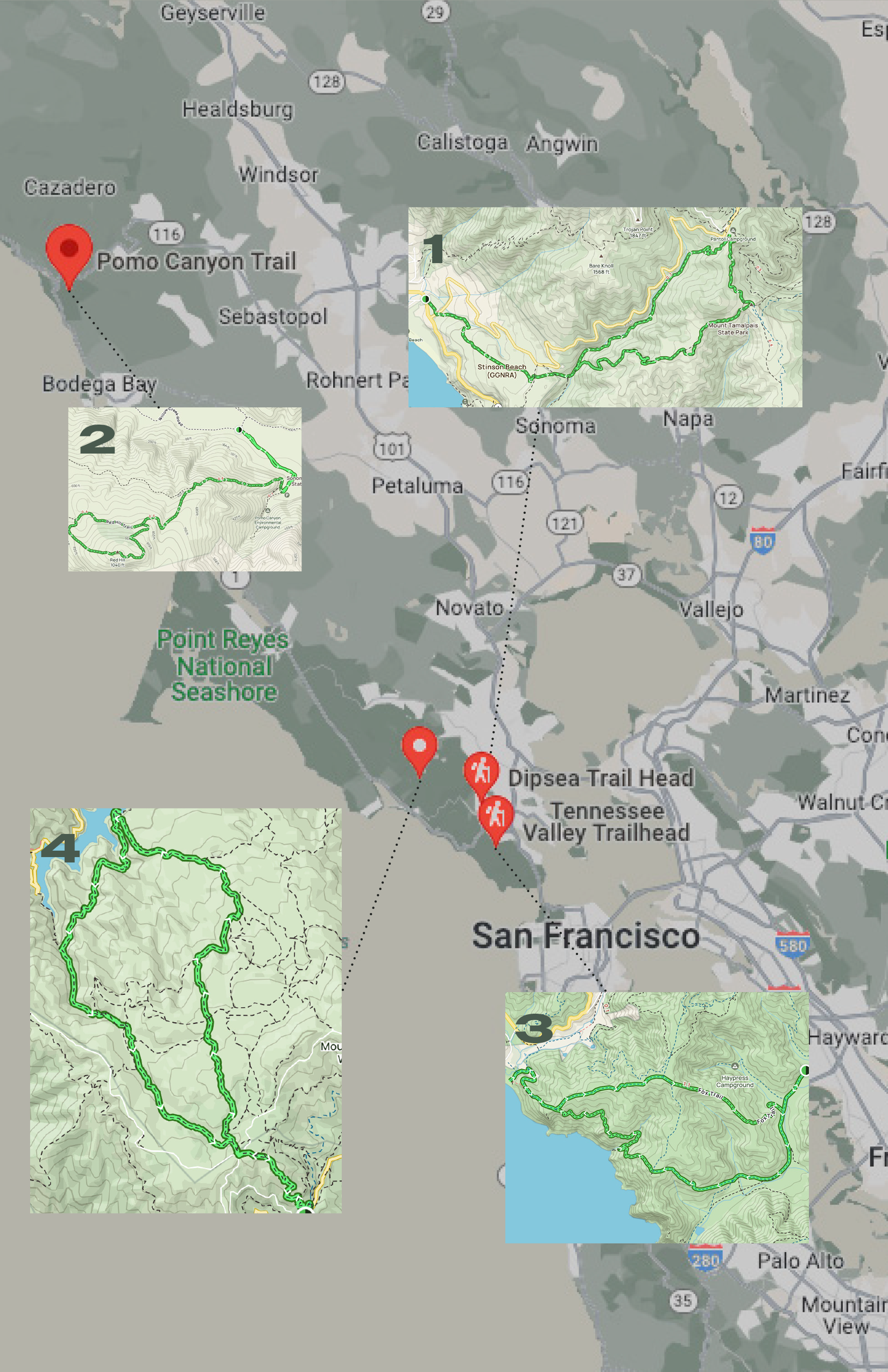
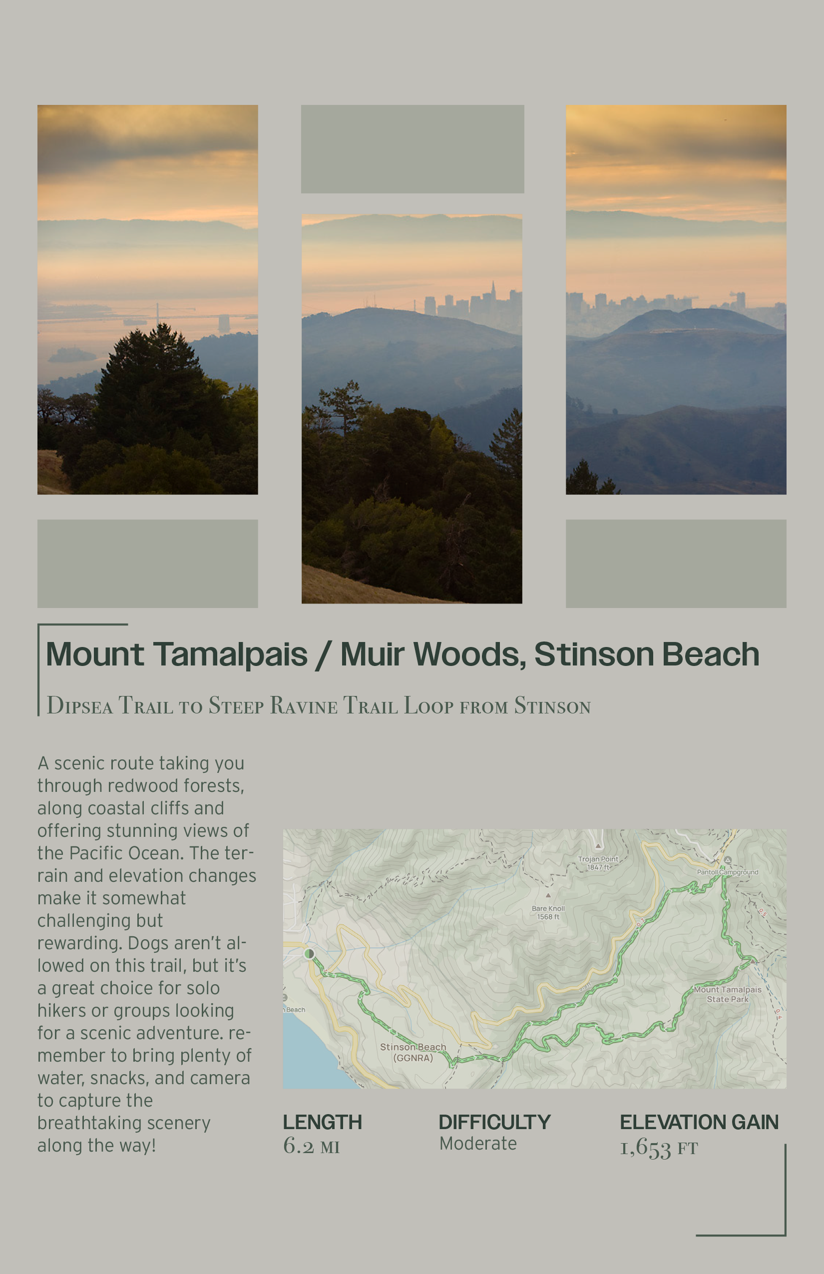
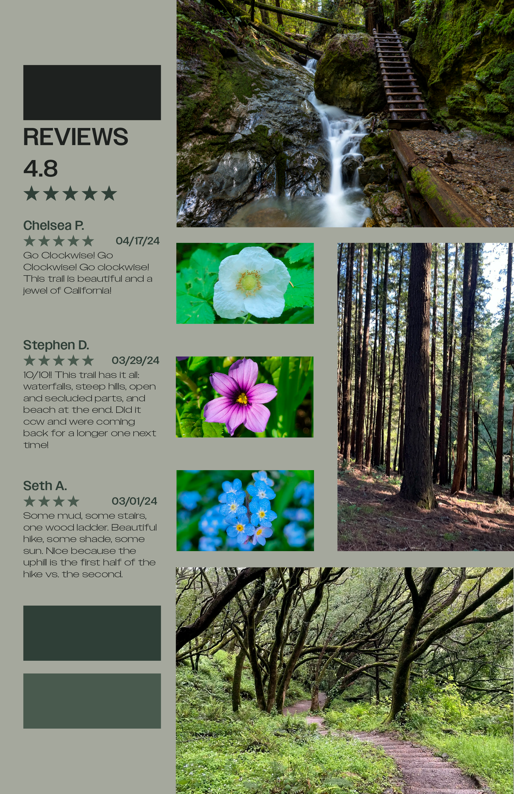
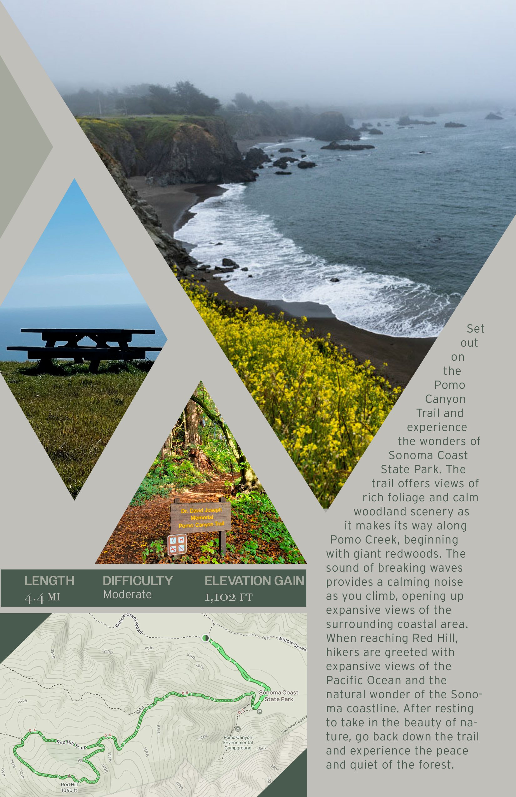
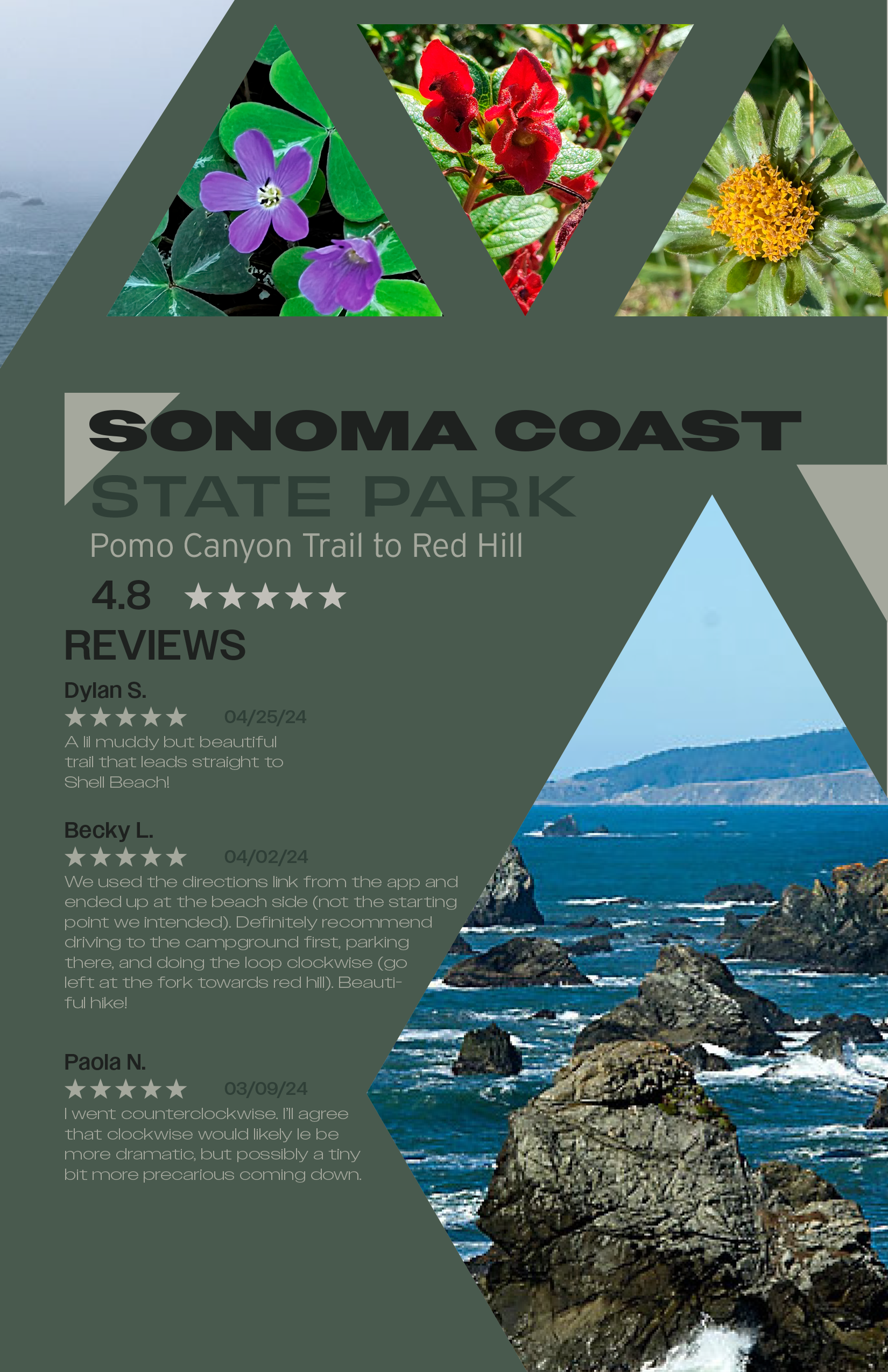
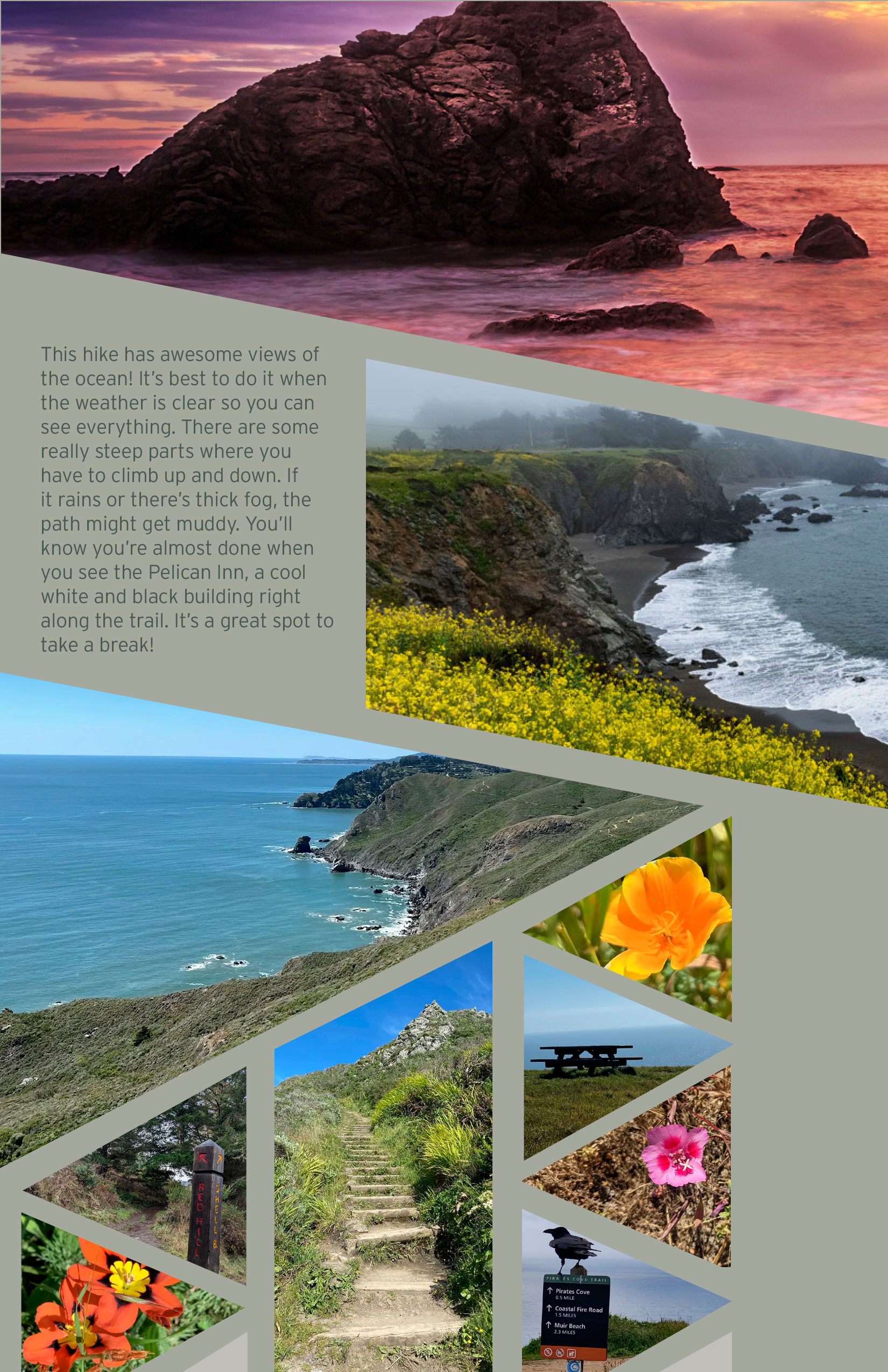
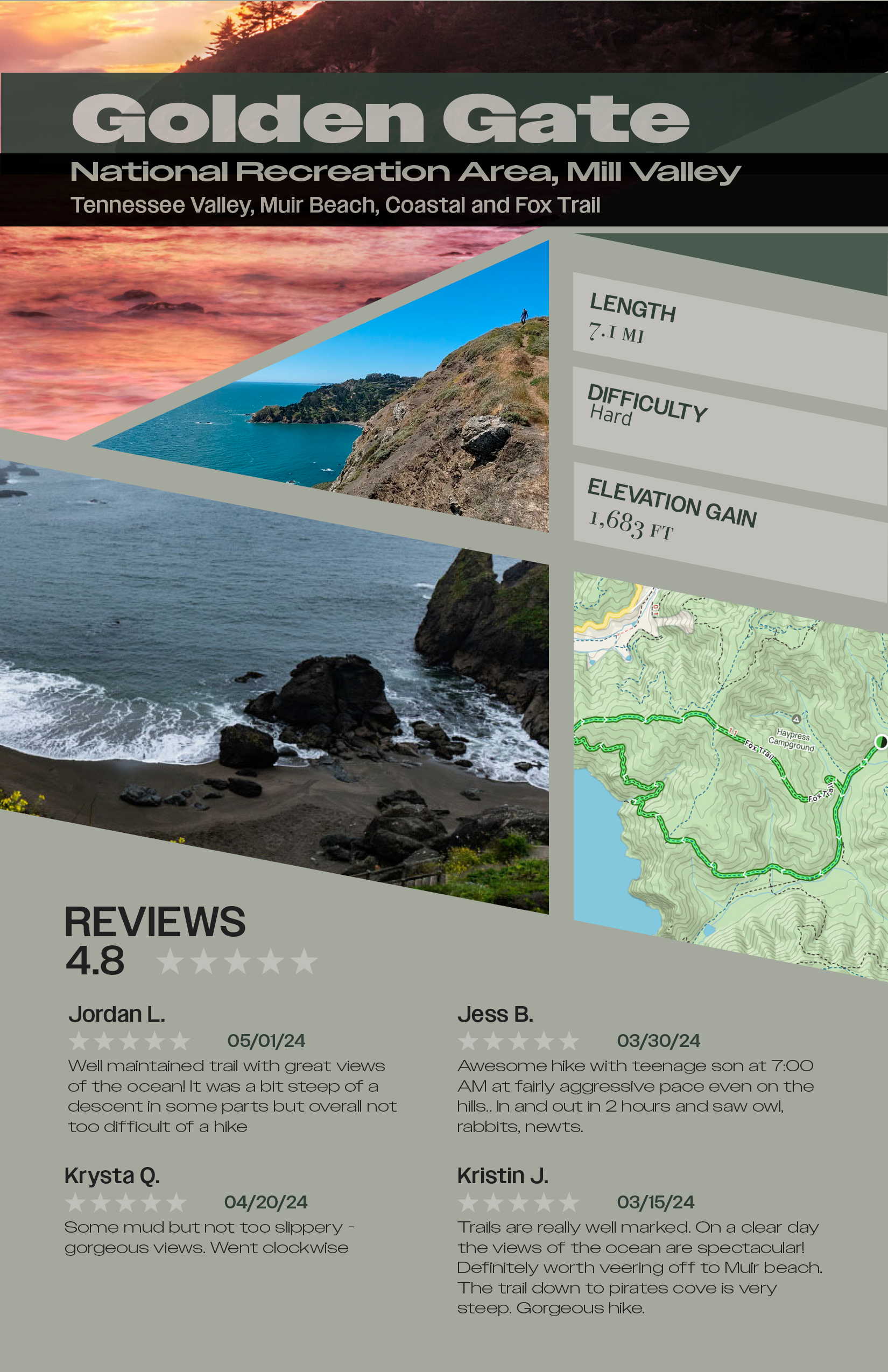
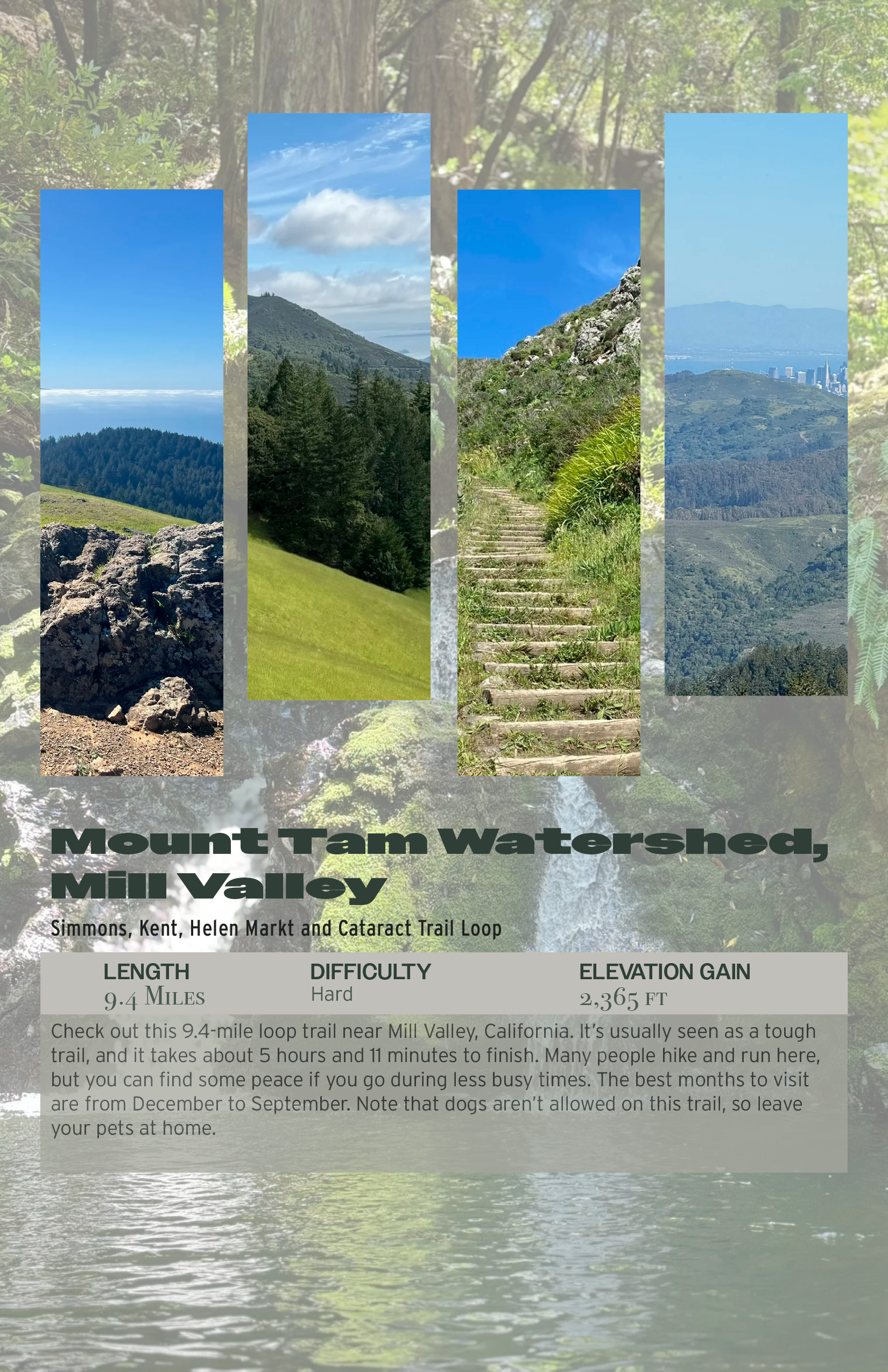
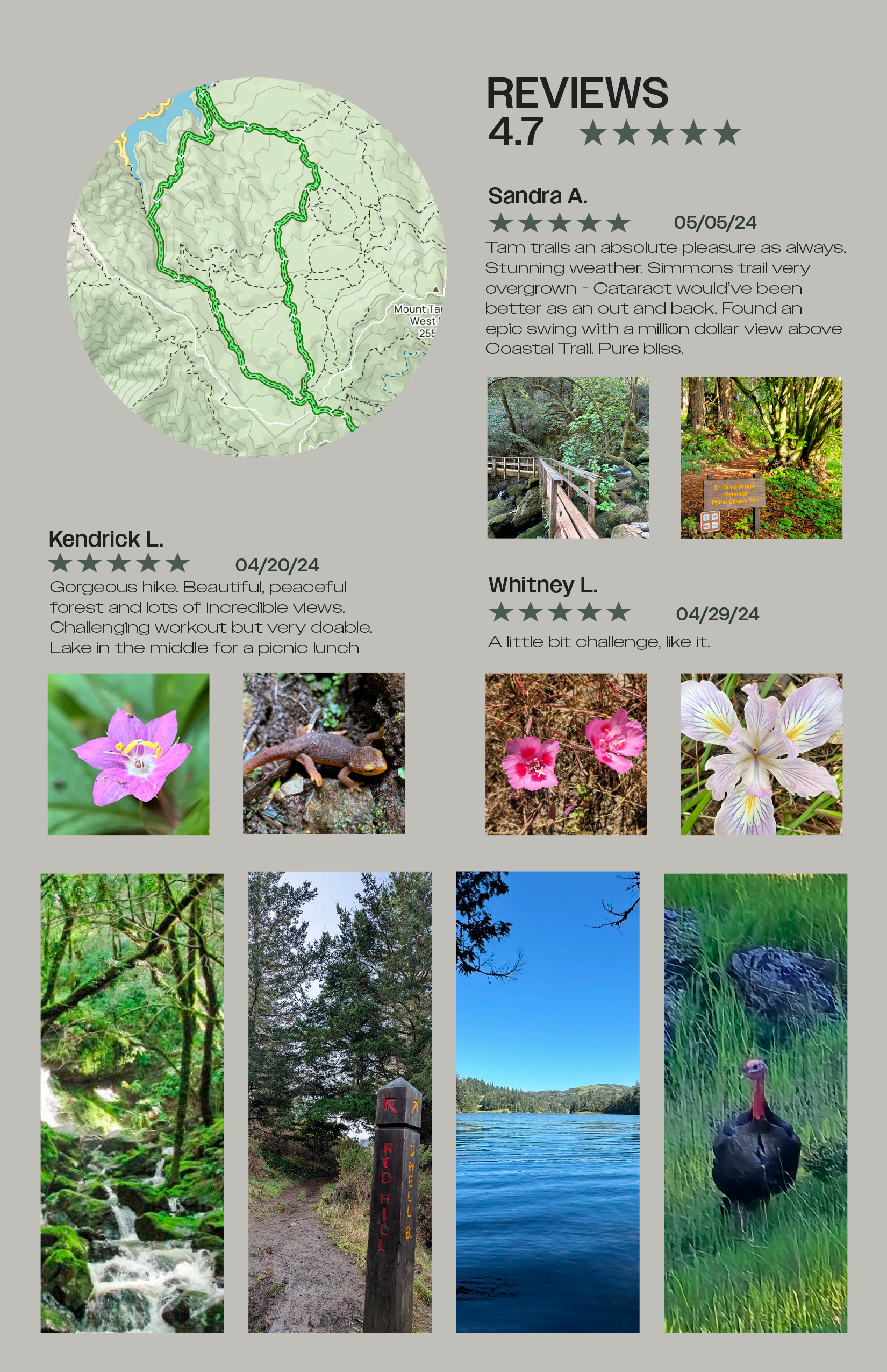
This 12-page guide highlights four breathtaking hikes in the Bay Area, blending stunning photography with essential trail details like length, difficulty, and key highlights. Designed in Adobe InDesign, it demonstrates my layout, typography, and visual storytelling expertise.
Design Elements
Consistent Layout – A structured grid ensures harmony and readability.
Typography – Bold sans-serif headings create impact, while clean serif body text enhances readability.
Imagery & Composition – High-resolution photos, full-page spreads, and balanced white space create an engaging experience.
Visual Flow – Thoughtful text and image placement guide readers seamlessly, with callout boxes for key insights.
This project showcases my ability to create visually compelling and user-friendly designs, making outdoor exploration both inspiring and accessible.
